Let’s be real: your brand’s look is often the very first thing people notice about you. Before they read your clever captions, your carefully written website copy, or even your offers, they’ve already made up their mind based on colours, fonts, and logos. That’s the power of brand design.
Brand design is the visual expression of your brand — the way your business “dresses up” in the world. From your logo and colors to typography and imagery, it tells a story before you’ve said a single word.
And if that story is messy, inconsistent, or all over the place? People notice.
Why Consistency in Brand Design Matters
Think of brand design as your business’s first handshake. A sloppy handshake (different fonts here, random colours there, visuals that don’t match your vibe) doesn’t exactly build trust.
A consistent design, on the other hand, makes your brand instantly recognisable. It helps people remember you, find you again, and — most importantly — trust you. Because when your design feels intentional, your audience feels like you know what you’re doing.
Consistency across all your touchpoints — website, social media, proposals, packaging — is what creates that “oh, I know them!” moment.
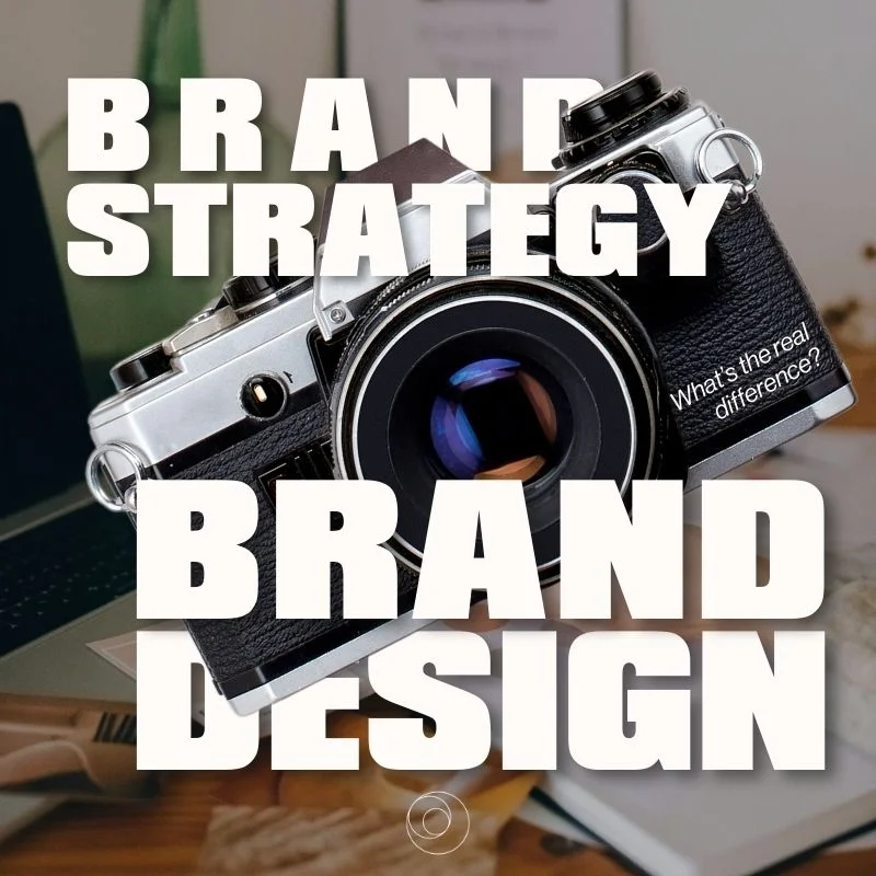
Brand Strategy vs. Brand Design: What’s the Difference?
These two terms get mixed up a lot, but they’re not the same thing.
Brand Strategy is your recipe. It’s your vision, values, goals, and how you plan to reach them. Strategy gives direction.
Brand Design is the cake. It’s the visuals, the style, the look and feel that bring that strategy to life.
Without strategy, design is just decoration. Without design, strategy is just words. Together, they create a brand that actually works.
How Great Design Builds Confidence (for You and Your Clients)
A strong visual identity doesn’t just impress your audience — it also gives you confidence. When your brand looks polished, cohesive, and professional, you show up differently. You own your space.
For your audience, consistent design means clarity. They know instantly who you are and what you stand for, no matter if they’re on your Instagram, your newsletter, or holding your business card. This clarity builds trust — and trust leads to sales.
The Role of Colours and Symbols
Colours are not just pretty decoration — they carry emotion. They make people feel something before they think.
Blue → trustworthy and calm
Green → nature, growth, sustainability
Red → passion, energy, urgency
Yellow → optimism, creativity, warmth
The same goes for symbols and icons. Think about the Nike swoosh, the Apple apple, or the Mercedes star. They don’t just represent a company — they trigger a whole set of feelings and associations.
Choose your colours and symbols wisely. They need to resonate with your audience, not just look nice on your Pinterest board.
Consistency = Recognition
The more consistent your design, the faster people will recognise you. That’s the secret behind a strong brand identity.
Consistency means using the same:
- Logo: always clean, clear, and adapted for different formats.
- Colour palette: applied across all touchpoints.
- Typography: fonts that feel “so you” and are easy to read.
- Imagery: graphics and photos that match your vibe.
When all these elements work together, you’re no longer just another business. You’re a brand.
Moodboards: Your Brand’s Secret Weapon
Moodboards are where the magic starts. They’re visual collages of images, textures, colors, and fonts that capture the feeling of your brand.
They help you:
- clarify your vision,
- explore how your brand should look and feel,
- and make sure your design decisions stay consistent.
Pro tip: don’t overthink it. Collect visuals that feel aligned, arrange them, and see what patterns emerge. Tools like Pinterest or Canva make this process easy and fun.
Fonts: Small Detail, Big Impact
Fonts are like your brand’s voice. Are you speaking in elegant serif? Minimalist sans serif? Playful script?
Whatever you choose, it needs to:
- match your brand personality,
- be consistent across all materials,
- and, please, be readable. (Your audience shouldn’t need a magnifying glass to get through your captions.)
The Power of Consistency
At the end of the day, consistency is the secret ingredient of every successful brand. It builds recognition, trust, and credibility.
The easiest way to keep everything aligned? Create a brand style guide. This document outlines your logo usage, colours, fonts, imagery, and even tone of voice — so your brand always looks and sounds like you, no matter who’s creating content.
Conclusion: A consistent design creates trust and recognition value.
Your brand design is more than “making things look nice.” It’s how your audience experiences you at first glance.
When your design is consistent, cohesive, and aligned with your strategy, you’re not just creating a business that looks good — you’re building one people trust, remember, and come back to.
👁️ Ready to refine your visual identity? Start with a moodboard, choose your core colours and fonts, and build from there.
